
View by category
Compare (all metrics) lets you easily evaluate your research performance in comparison to others in your region, country and the world.
You can choose from a broad range of metrics, zoom in on a year range or subject area, and add data to reports. This enables you to compare your institution with others, benchmark its progress, and analyze developments in a field over time.
How
Select a topic below to view more information on setting up or using the Benchmarking module:
Setting up Compare
Compare lets you easily evaluate your research performance in comparison to others. How does your institution compare to others in your region, country or the world?
Choose from a broad range of metrics. You can use 27 different metrics to compare the performance of different types of entities, such as institutions, research teams and individual researchers.
See Which metrics are available to use in SciVal?opens in new tab/window
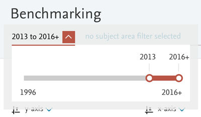
You can view publication data from 1996 until the present. Use the time period selector at the top of the page to select the start and end year.
You may want to exclude the current year because, by the end of the current year, Scopus has only received and indexed a certain portion of the current year’s Scopus sources from other publishers.
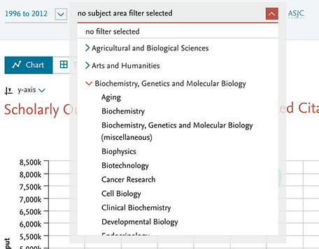
Interested in evaluating or comparing your performance within a specific discipline? Choose from 27 Subject Areas and 334 subcategories in the Scopus subject classification. Or use a different subject classification.
- Use the filter dropdown at the top of the page to select a specific subject area.
- The subcategories appear when you click on the arrow in a subject area.
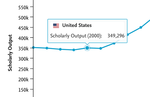
Here is what there is to know about the chart:
|
|
|---|---|
Chart legend | Each entity plotted on the chart has a different color and symbol. This is shown in the legend shown below to the chart. You can hide a particular entity from the chart by clicking on the "eye" icon next to that item in the legend. You can keep a label on the chart using the 'pin' icon and create a reference line for the entity using the line icon. Below the legend, you can find the Metrics detail option which gives you further information on the metrics you selected. |
Data pop-ups | Hover over a data point on the chart and a small pop-up will appear with the metrics you have selected and their values for that year. |
Export the chart | You can export the underlying data as either CSV or XLS by clicking 'Export' link. When multiple metrics are selected, you can export an aggregation of the selected years, or to see each metric for each year. If you've selected the timeline motion chart vizualisation, there is also the option to export the chart as an animated GIF file. |
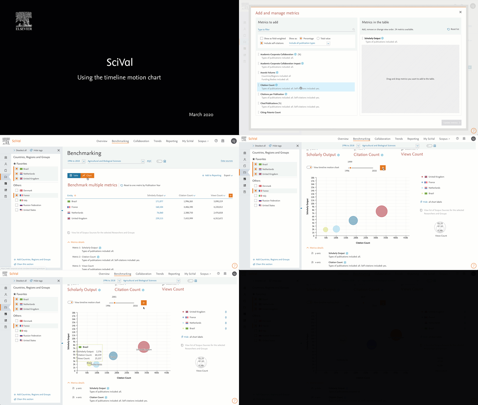
When 2 or 3 metrics are visible in the Benchmarking chart view, the timeline motion chart is available. The motion chart allows you to see how the metrics for your chosen entities develop over time.
To use the timeline motion chart option, choose the metrics you’d like to see on the chart (up to 3), select the year range and click the Timeline motion chart slider
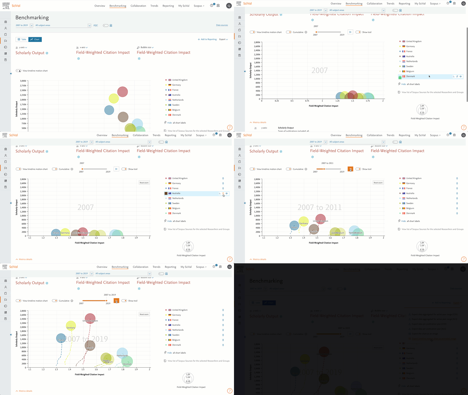
Once the timeline motion chart is chosen, there are 2 options available:
- Values per year
- Cumulative values
Values per year
This will use the values that you see in the table view and plot them for each year whilst the animation is running.
Note: in this view it is possible to see values decrease as time progresses. For example Citation Counts for articles in the current year are generally fewer than for articles that are 10 years old.
Cumulative values
The total value is displayed for each year time period for those metrics that can be aggregated. For example counts such as Scholarly Output, Citation Count, International Collaboration (total value) etc can be aggregated. For those that cannot be aggregated, for example percentage or average metrics, the cumulative average is instead displayed.
For example, if the Outputs in 10% Citation Percentiles (%) is selected, the yearly value is the first row and the cumulative value is calculated in the second row. For Scholarly Output, the yearly value is row four and the cumulative value is calculated in row five:
Year | 2017 | 2018 | 2019 | 2020 |
Outputs in 10% Citation Percentiles (%) | 20.9 | 19.3 | 22.9 | 18.3 |
Cumulative value | (20.9) / 1 = 20.9 | (20.9 + 19.3) / 2 = 20.1 | (20.9 + 19.3 + 22.9) / 3 = 21.0 | (20.9 + 19.3 + 22.9 + 18.3) / 4 = 20.4 |
Scholarly Output | 100 | 50 | 100 | 50 |
Cumulative value | 100 | (100 + 50) = 150 | (150 + 100) = 250 | (250 + 50) = 300 |
Here is what there is to know about the table:
|
|
|---|---|
Viewing a year range | When viewing a metric by year, you can scroll the table horizontally to see the values for all years in the selected year range. |
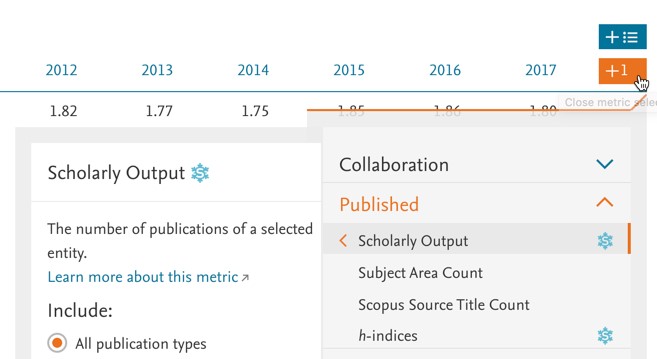
Adding metrics | You can add individual metrics to the table by clicking the +1 button, or multiple metrics in one go, by clicking the + button |
View the overall value | When viewing metrics over a year range, the rightmost column will show the overall value for that metric. This can be the total number of publications for the selected year range (for Scholarly Output for instance) or the overall value for the selected year range (for Field-Weighted Citation Impact for instance). |
View the underlying publications. | When numbers of publications are shown in the table, you can click on any number to view the actual list of publications. Numbers of publications are shown for Scholarly Output or Cited Publications, for example. |
Export the data | To export the data in the table to a spreadsheet file, choose the'Export' link. When multiple metrics are selected, you can export an aggregation of the selected years, or to see each metric for each year. You can then view and manipulate the data in an external spreadsheet application such as Microsoft Excel. |
Add a single metric with the +1 button:
Add multiple metrics:
Get a clear visual aid on how entities compare to each other, with horizontal and vertical reference lines in Benchmarking. For example, you can compare individual EU countries against the averages of the full EU group. Find the option in the entity key to the right side of the chart.

You can save any combination of chart or table to an analysis, to be used in Reports. This will save all the selected entities, metrics and options you have chosen. Click 'Add to Reports' to save the current view.
When you have selected one or more researchers or groups of researchers in Benchmarking, you can view the list of Scopus Sources for those entities.
Click on 'View list of Scopus Sources for the selected Researchers and Groups' below the chart or table in Benchmarking to open the 'List of Scopus Sources' window.
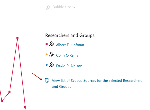
This shows you a breakdown by academic source (i.e. Scopus sources, books etc.) of the selected researchers' and groups' publication output and impact:
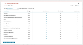
As usual the publication output is limited to the selected year range and subject area. The sources are ordered by highest CiteScore, SNIP or SJR value.
View citation impact. By default, Scholarly Output is shown, but you can also view citation impact. Use the drop-down menu at the top to switch from Scholarly Output (number of publications) to either Citation Count or Field-Weighted Citation Impact.
Export the list of Scopus Sources. Go to the Export menu and select "Export the data to a spreadsheet file". This will export the CiteScore, SNIP and SJR values of each Scopus Source, as well as the Scholarly Output, Citation Count and Field-Weighted Citation Impact for each researcher or group's output in that Scopus Source.
Define a research area. You can quickly define a new research area based on this list of Scopus Sources. Use the link in the Shortcuts menu to start the define process for a research area with the list of Scopus Sources preselected. If desired, you can then add additional Scopus Sources, remove Scopus Sources or filter the research area by a specific institution or country for instance.
This enables to you to create a Scopus Source profile for a group of researchers and benchmark the group against that profile. You can use this to compare the Scopus Sources profile of one group of researchers to the Scopus Sources profile of another group. Or you can see how the citation impact of your researcher group compares to the impact of all researchers publishing in the same set of Scopus Sources.
Using Compare
Let’s say that your institution, Athena University, wants to compare its research performance with SUNY Buffalo, Yale and Dartmouth.
Start by setting up the list of institutions, using the entity selection panel on the left side of your screen. Make sure your institution and the peer institutions are all selected (checked off) in the entity selection panel.
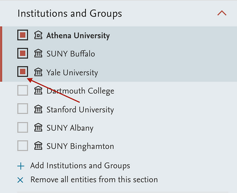
- If an institution is not listed, click 'Add Institutions and Groups' and start typing the name of that institution. Then select the institution from the list of search results that appears below the text field.
- By default, you will view Scholarly Output by publication year. This shows you the total research output of your selected institutions over a period of time.
- Use the buttons along the top of the chart to select different metrics. Use the 'y-axis' button to change from Scholarly Output to another metric. To compare two different metrics, select a second metric from the 'x-axis' button.

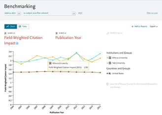
Field-Weighted Citation Impact is a good metric to use when you want to compare your institution’s research performance to the national average. This is because Field-Weighted Citation Impact adjusts for differences in citing behavior across disciplines. A score of 1.00 means citations are as expected based on the global average. More than 1.00 means that citations are more than expected. Less than 1.00 means the citations are less than expected.
- Start by setting up the list of institutions, using the entity selection panel on the left side of your screen. Make sure your institution and the peer institutions are all selected in the entity selection panel.
- Make sure your institution and your country are selected in the entity selection panel on the left side.
- If your country is not listed in the entity selection panel, click 'Add Countries and Groups' and start typing the name of that country. Then select the country from the list of search results that appears below the text field.
Example:
Let’s say that you want to compare your institution, Athena University, to the national average. The Field-Weighted Citation Impact for Athena was 1.83 in 2011. This means citations were 83% higher than expected based on the global average. When plotted against the United States and Yale, we can see that Athena’s Field-Weighted Citation Impact is higher than the US national average, but it is slightly lower than Yale.
Other metrics that can be used to compare your institution to the national average include Outputs in Top Percentiles (by percentage), and Publications in Top Journal Percentiles (by percentage), and Collaboration (by percentage).
You can view metrics for a specific field of research over time. This lets you analyze developments in that field, such as whether the field is emerging, declining or levelling off.
You can use either subject areas or self-defined research areas. Subject areas are categories in the Scopus Subject Classification. They represent broad areas of science, such as chemistry or engineering. Self-defined research areas can be more granular or interdisciplinary.
To use a subject area:
- Choose the subject area from the filter selector at the top of page.
- Select the World from the entity selection panel.
- In addition to the World, you can also select your country or your institution. This lets you compare your national or institutional performance to the international trend.
Select Scholarly Output from the 'y-axis' button and 'Publication Year' from the 'x-axis' button. You can now see the year-by-year publications trend in this subject area.
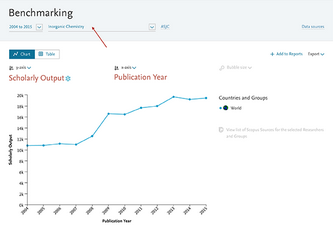
- Try some other metrics, like Field-Weighted Citation Impact, Collaboration or Outputs in Top Percentiles.
SciVal also allows you to define your own research areas and view these in the Benchmarking module.
- Use the entity selection panel on the left-hand side to select a previously defined research area.
- You can also define a new research area. In the entity selection panel, click on 'Add Research Areas', then 'Define a new Research Area'.
- Select the research area in Benchmarking to see the worldwide output in that field.
- You can select multiple research areas to compare the output in one research area to the output in another area.
If you have access to the Overview module, you can make use of it to identify suitable benchmark institutions for your institution. These are institutions that you can use to compare your own institution against, in order to evaluate how well your institution has performed.
Say you are looking for benchmark institutions for Athena University within the United States in the field of chemistry.
- In the Overview module, select the United States and filter by chemistry.
Go to the Institutions tab. This will now list the top U.S. institutions by number of publications in chemistry Scopus Sources.
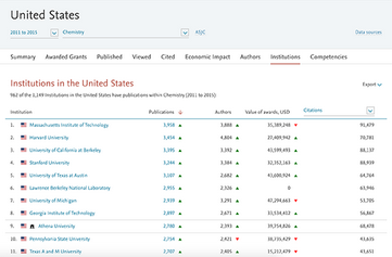
- You can now select one or more institutions from this list that you would like to match or exceed in terms of research performance.
You can use Copmare to find the top collaborating institutions of your institution. You can then compare these institutions in Compare.
- Go to the Overview module and select your institution.
- Go to "Top collaborating institutions" under the Collaboration tab
Choose 'Benchmark these institutions' from the Shortcuts menu.
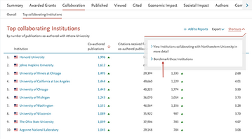
- You will now jump to the Benchmarking module and your institution, plus the top collaborating institutions will be selected there.
Note: the selected year range in Overview will also be selected in Benchmarking.
Did we answer your question?
Related answers
Recently viewed answers
Functionality disabled due to your cookie preferences